Spending Data Handbook
Engaging the public online
Thanks to the Internet, it is now easier than ever before to directly engage the public through websites and social media. This chapter collects some advice and inspiring examples to help you reach the public with your spending data research.
Infographics
The art of the infographic is to make the complex look simple. An effective image can communicate huge amounts of information in a single picture. Infographics are the key to presenting data-driven research to the general public.
Budget infographics
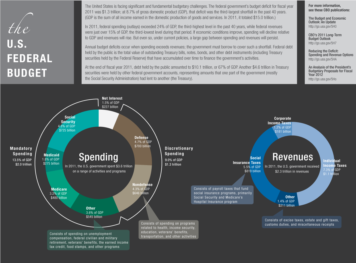
Below is an infographic summarizing the history of the US Federal Budget, by the Congressional Budget Office (CBO). It shows the budget over time and as a percentage of GDP in the context of total spending and revenue. This graphic was created to emphasise that the federal government's budget deficit for 2011 was the third largest in the past 40 years.
Spending infographics
This "binder full of burgers" infographic was created to show the sandwich of spending for Barack Obama's 2012 presidential election campaign. The data is not especially novel, but the graphic is fun and engaging.

Interactives
Adding interactivity to an infographic can add another level of clarity to your presentation. Even a simple form of interactivity like hover-over text giving the exact value of a bar in a bar chart can go a long way towards making an infographic a truly transparent presentation of data.
In our experience, there are two types of interactive graphics that work very well. One is where the user finds their own path through a complicated landscape of data. An example of this style would be a map of the world where you can zoom in to each country to explore the subset of a dataset related to that country. The other successful interactive style is one in which the infographic guides the user through a story.
In recent years, interactive infographics have flourished and become easier to produce. Anyone with a Google account can now easily make interactive maps and charts. The tools to manipulate and display data in more sophisticated ways have also become more accessible thanks to efficient and usable JavaScript libraries like D3.js. Using these libraries requires a bit of technical skill, so you may want to reach out to other organizations, as described in the nextsection of this book.
Budget interactives
An interactive graphic can allow people to choose their own budget. The interactive chart below is called Citizen Budget and was produced by the non-profit Open North. It shows Canadian budgets and lets citizens play at being the official controller. They can cut spending in any area they choose, but the budget has to balance.

Spending interactives
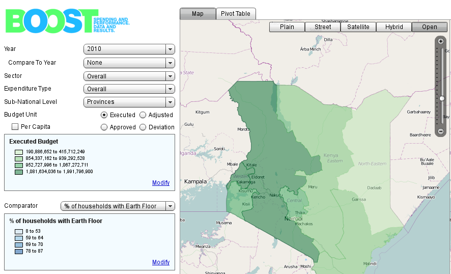
The World Bank has produced a spending database called BOOST in collaboration with various governments to digitise their spending data. BOOST is especially targeted at countries that wouldn't otherwise have the necessary technical resources. One of these countries is Kenya, and the data has been displayed to great effect at WorldBank BOOST Kenya.
Online reports
An example of a very short report is from Enough is Enough (EiE), a coalition of Nigerians aiming to enhance citizen engagement and good governance. Their EiE report on the state of the nation provides a very concise summary of the major spending corruption stories they identified that year, along with links to sources.
Podcasts and videos
A complex piece of data-driven research is almost always easier to digest in the form of a podcast than as a long written report, even if the writing on both is very strong. Given the right push, a well made podcast is also likely to be be shared, generating discussion of your work.
The NPR Planet Money podcast rose to fame for its incredibly accessible, award-winning coverage of the 2008 global financial crisis. Planet Money now covers financial issues all over the world on its weekly podcast.
Mobile technologies
There are a few free and open tools that allow you to display your data through a mobile phone or tablet app. AKVO is a non-profit foundation, and they have described how their AKVO FLOW platform works, using free and open-source software, to communicate your data through an Android mobile app.
Social media
Building a community around your cause and your data analysis is really valuable. Setting up a mailing list and creating a space to collaborate like on a wiki can lead to interesting social connections at relatively low cost and can lead to you finding really devoted and knowledgeable new people to work with. The OKFN mailing lists, built using Mail Man, are a good example.
There are also the big social media companies like Twitter and Facebook, of course! These are great for reaching large numbers of people who have anything from a passing interest to complete devotion to your cause. To have the greatest impact on Twitter or Facebook, tailor your presentation to the format by creating a full "package" containing the story, the data, and other resources on a single page that can be linked in a tweet or a Facebook post.